


Create Navigation
This navigation consists of top navigation (Main Menu) and side navigation (Sub Menu). Styled by CSS and selected items are highlighted using Javascript.
1. The Main Menu Component
Create a Go template for the Top Navigation (Main Menu)
{{define "nav}}

<header>
  <a class="logo" href="/home">goWebStatic</a>
  <nav>
    <a class="btnnav" href="why">Why?</a>
    <a class="btnnav" href="prepare">Prepare</a>
    <a class="btnnav" href="build">Build</a>
    <a class="btnnav" href="deploy">Deploy</a>
    <a class="btnnav" href="optimize">Optimize</a>
    <a class="btnnav" href="extra">Extra</a>
    <a class="btnnav" href="about">About</a>
  </nav>
  <a href="search">
    <div class="search">
      <img src="icn/search.svg" alt="Search this Site">
    </div>
  </a>
  <img src="icn/hamburger.svg" class="hamburger" onclick="hamburger()" alt="Menu" />
</header>

{{end}}
2. The Sub Menu Component
Create a Go template for the Side Navigation (Sub Menu)
{{define "sub_build"}}

<div class="pagenav">
  <ul data-mainnav="/build"> <--- the main menu that should be selected
    <li class="btnpagenav"><a href="/build">Building</a></li>
    <li class="btnpagenav"><a href="/server">1. Go Server</a></li>
    <li class="btnpagenav"><a href="/navigation">2. Create Navigation</a></li>
    <li class="btnpagenav"><a href="/pages">3. Create Pages</a></li>
  </ul>
</div>

{{end}}
3. Page with Navigation Components
All Go Templates are build by same concept. Pages with sub templates (in this case Navigation and the global httphead).
<!DOCTYPE html>
<html lang="en">
<head>
{{template "httphead""" . }} <!-- the dot pass the url to sub template -->
<title>The Web Server</title>
<meta name="Description" content="Go has its own built in Apache or Nginx. Which means that it is both simpler and sometimes different.">
</head>
<body>
{{template "nav"}} <--- Top Navigation (Main Menu)
<main>
{{template "sub_build"}} <--- Side Navigation (Sub Menu)
<div class="content">
<div class="horzbar" onclick="showsub()"><h2 class="ellipses">…</h2></div>
<div class="card">
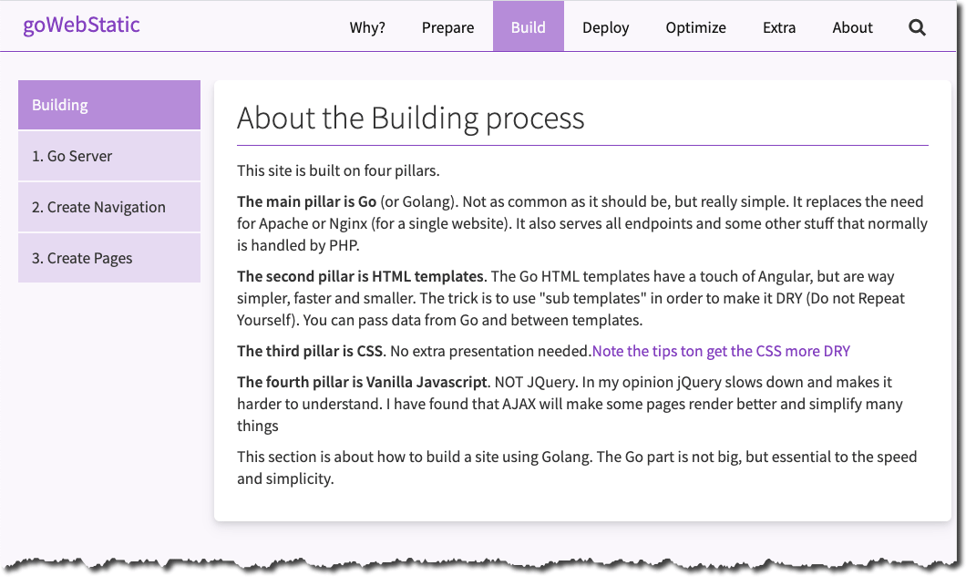
<h1>About the Building process</h1>
<div class="line"></div>
<p>This site is built on four pillars.</p>
<p><strong>The main pillar is Go</strong> (or Golang). Not as common as it should be, but really simple. It replaces the need for Apache or Nginx (for a single website). It also serves all endpoints and some other stuff that normally is handled by PHP.</p>
<p><strong>The second pillar is HTML templates</strong>. The Go HTML templates have a touch of Angular, but are way simpler, faster and smaller. The trick is to use "sub templates" in order to make it DRY (Do not Repeat Yourself). You can pass data from Go and between templates.</p>
<p><strong>The third pillar is CSS</strong>. No extra presentation needed.<a href="drycss">Note the tips ton get the CSS more DRY</a></p>
<p><strong>The fourth pillar is Vanilla Javascript</strong>. NOT JQuery. In my opinion jQuery slows down and makes it harder to understand. I have found that AJAX will make some pages render better and simplify many things</p>
<p>This section is about how to build a site using Golang. The Go part is not big, but essential to the speed and simplicity.</p>
</div>
</div>
</main>
</body>
</html>
4. The Javascript To Select Current Position
This Javascript has only one purpose. To select the clicked items both in Main and Sub Menus. The Main Menu item that should be selected is stored as "data-mainnav" in each Sub Menu Component.
var subnav = document.querySelectorAll('li a')
const current = window.location.href;
window.onload = select

function select(select) {
  subnav.forEach(function(anchor) {
    if (current.indexOf(anchor.href) != -1){
      anchor.classList.add("selected");
    } else {
      anchor.classList.remove("selected");
   }
  });
}

/* selecting mainbtn and subnavbtn based on current url */
const btnnav = document.querySelectorAll('.btnnav');
const subnavbtn = document.querySelectorAll('li a')
const data = document.querySelector(".pagenav ul").getAttribute("data-mainnav");

window.addEventListener("DOMContentLoaded", (event) => {
  /* main nav */
  btnnav.forEach(el => {
    if (data.includes(el.pathname)) {
      el.classList.add("selected");
    } else {
      el.classList.remove("selected")
    }
  });
});
5. The CSS
The styling of the Main Menu:
.logo {
  display: inline-flex;
  margin-right: auto;
  font-size: 1.4rem;
  height: 55px;
  padding-left: 10px;
  line-height: 3rem;
}

header {
  position: fixed;
  top: 0px;
  display: flex;
  justify-content: right;
  align-items: center;
  font-family: inherit;
  color: var(--black);
  flex-direction: row;
  background-color: var(--bg);
  padding: 0px 15px 0px 15px;
  border-bottom: 1px solid var(--dark);
  height: 56px;
  width: 100%;
  z-index: 10;
  overflow: hidden;
}

nav {
  display: flex;
  align-items: center;
  justify-content: center;
}

.btnnav {
  display: inline-block;
  color: #111;
  height: 55px;
  padding: 16px 20px 0px 20px;
  font-size: 1rem;
  line-height: 1.5rem;
  border: none;
  text-decoration: none;
  cursor: pointer;
  background-color: transparent;
}

.btnnav.selected {
  background-color: var(--medium);
  color: var(--bg);
}

.dropdown {
  position: relative;
  display: inline-block;
}

.search {
  display: inline-flex;
  width: 56px;
  height: 56px;
}

.hamburger {
  display: none;
  width: 56px;
  height: 56px;
}

.btnnav:hover,
.hamgurger:hover,
.search:hover {
  background-color: var(--lite);
}

.shadow {
  box-shadow: rgba(1, 1, 1, 0.5) 0px 1px 12px 0px;
}

@media screen and (max-width: 880px) {
  .hamburger {
    display: block;
  }

  nav.dropham {
    display: flex;
    flex-direction: column;
    align-items: flex-start;
    justify-content: left;
    background-color: #fff;
    right: 15px;
    position: fixed;
    top: 56px;
    width: 200px;
    box-shadow: 0px 8px 16px 0px rgba(0, 0, 0, 0.2);
  }

  .btnnav {
    height: 55px;
    width: 100%;
    text-align: left;
  }

  .dropdown {
    text-align: left;
    height: 55px;
    width: 100%;
  }

  .dropdown-content {
    min-width: 200px;
  }

  nav {
    display: none;
  }
}
The styling of the Sub Menu with responsive function:
.horzbar{
  display: none;
  background-color: var(--bg);
  width: 42px;
  height: 42px;
  text-align: left;
  margin-bottom: 10px;
  border-radius: 7px 7px 0px 0px;
}

.ellipses  {
  color: var(--dark);
  font-size: 2rem;
  line-height: 2rem;
  overflow: hidden;
  text-align: left;
  background-color: var(--bg);
}

.btnpagenav {
  display: flex;
  font-weight: 400;
  margin-left: 20px;
  color: var(--black);
  cursor: pointer;
  width: 200px;
  text-align: left;
  font-size: 1rem;
  line-height: 1.2rem;
  height: 56px;
  border-bottom: 1px solid var(--bg);
  overflow: hidden;
}

.pagenav{
  overflow: unset;
}

.btnpagenav:hover {
  background-color: var(--medium);
  color: var(--bg);
}

.btnpagenav.selected {
  background-color: var(--black);
  color: var(--bg);
}

ul {
  list-style-type: none;
}

li a {
  display: flex;
  padding-left: 15px;
  align-items: center;
  height: 54px;
  color: var(--black);
  font-size: 1rem;
  font-weight: 400;
  background-color: var(--lite);
  width: 100%;
  text-align: left;
  list-style: none;
  cursor: pointer;
  white-space: nowrap;
}

li a:hover {
  background-color: var(--hover);
}

li a.selected {
  background-color: var(--medium);
  color: var(--bg);
}

@media screen and (max-width: 880px) {
  .pagenav {
    position: absolute;
    display: none;
    margin-left: 5px;
  }

  .btnpagenav{
    margin-left: 0px;
  }

  .showsub{
    display: flex;
    left: 10px;
    top: 50px;
    background-color: var(--bg);
    -webkit-box-shadow: 5px 5px 16px -4px rgba(0,0,0,0.7);
    box-shadow: 5px 5px 16px -4px rgba(0,0,0,0.7);
    z-index: 3;
  }

  .horzbar{
    display: block;
  }

  main{
    top: 57px;
  }
}